Numbers and stories: Why good research requires both types of data
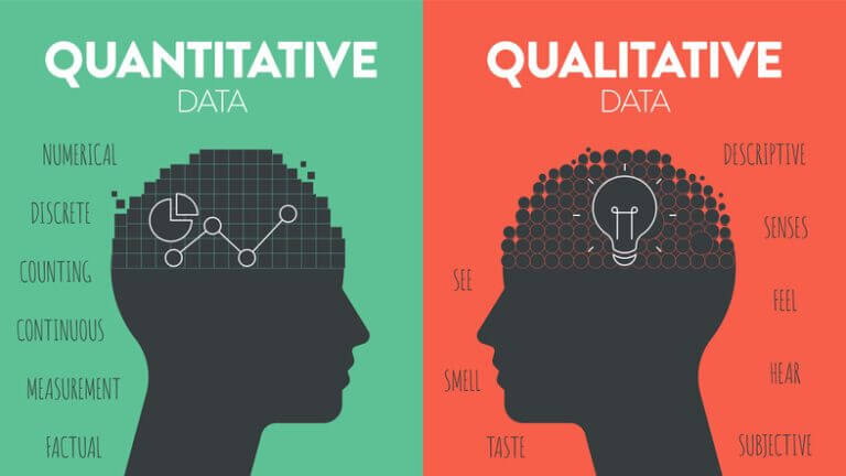
When you do user research, it’s important to collect two kinds of data: quantitative and qualitative. Each one tells a different part of the story. Quantitative data gives you the numbers — like how many people clicked a button or how long they stayed on a page. Qualitative data gives you the why behind those numbers — what motivates people, confuses them, or frustrates them.
Many people rely on only one type of data, usually the numbers. Numbers are helpful, but they don’t always tell you why something is happening. On the other hand, focusing only on user interviews or open-ended feedback might not show you how common an issue really is. By combining both types of data, you’ll see a full picture of how your product or website is performing.
Below, we’ll explore what quantitative data is, why it matters, and how to collect it. Then we’ll look at why qualitative data is just as important. We’ll also show examples of how mixing the two types of data leads to better decisions and stronger user experiences.
In this article

What is quantitative data?

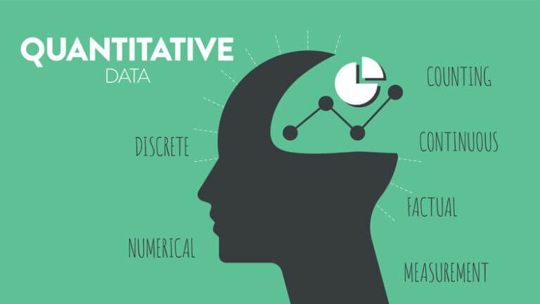
Quantitative data is any information you can measure or count. It can tell you how many people are using a product, what percentage of users prefer one feature over another, or how often people leave a page. You’ll often see quantitative data presented as charts, graphs, or percentages.
Quantitative data answers questions like:
- “How many people visit this site each day?”
- “Which link on our homepage gets clicked the most?”
- “How many users completed the checkout process?”
These metrics are usually easier to share with decision-makers because they show clear patterns or trends. It’s also simpler to compare one set of numbers to another over time.
But numbers alone don’t always paint a complete picture. If you see a high drop-off rate on a sign-up form, you know there’s a problem. But you might not know exactly what that problem is—maybe the form is too long, or maybe the language is confusing. That’s where qualitative data comes in.
Examples of quantitative data
Here are some common types of quantitative data you might track:
- Page visits (Traffic volume)
How many visitors come to your site each day, week, or month?
Which pages get the most traffic? - Conversion rate
Of all the people who land on a specific page, what percentage completes a key action (like signing up, making a purchase, or clicking a call-to-action)? - Click-through rate (CTR)
If you have a button or link, how many people who see it actually click it? - Time on page (or Session duration)
On average, how long do visitors spend on a certain page? - Scroll depth
How far down a page do most visitors scroll? - Bounce rate
What percentage of visitors view just one page and then leave your site? - Heatmaps
Where do people click the most on a page?
Are certain parts of the page getting ignored? - Form completion rate
Of all the visitors who start filling out a form, how many actually submit it? - Survey responses (Numerical)
When you ask questions like “On a scale of 1–5, how would you rate your experience?” the answers can be tallied and turned into stats. - A/B test results
You compare two versions of a page or feature (Version A and Version B). How do the numbers (clicks, sign-ups, purchases) differ? - Adoption rate
How many people use a new feature compared to the total user base? - Customer retention rate
How many customers stay with you month after month (or year after year)?
These metrics help you see big-picture trends. They can point you to problem areas or confirm whether a new feature is catching on.
Methods for collecting quantitative data
There are several ways to gather quantitative data:
- Web analytics platforms
- Tools like Google Analytics or Adobe Analytics track page visits, bounce rates, user paths, and more.
- They also provide dashboards so you can quickly spot trends.
- Heatmap and session recording tools
- Tools like Hotjar or Crazy Egg show where visitors click or move their mouse.
- This helps you see if users skip important elements on a page.
- In-product analytics
- If you have a mobile app or a SaaS product, you can track how often people use certain features.
- You can also measure how many times a day they log in or what actions they take inside the product.
- A/B testing platforms
- Services like Optimizely or VWO let you compare two versions of a web page or app feature to see which one performs better.
- You look at conversions, clicks, or sign-ups to judge the winner.
- Online surveys
- Services like SurveyMonkey or Typeform let you ask multiple-choice or rating-scale questions.
- This data is easy to analyze because it’s already in numeric form.
- Email or SMS surveys
- After a user signs up or makes a purchase, you can send a follow-up request for a quick rating.
- This can be an easy way to keep gathering data without interrupting the user’s experience.
- Product usage logs
- On the back-end, you can track how many times a feature is opened or how long someone spends on a task.
- This requires coding an analytics framework into your product.
- Infrastructure metrics
- These numbers track load times, server errors, or downtime.
- While more technical, they can show you whether slow load times affect bounce rates or user satisfaction.
Each of these methods gives you stats that can highlight problem areas or successes. But remember, these numbers only tell you what is happening—not necessarily why.
What is qualitative data?
Qualitative data shows you the human side of the story. It comes from:
- User interviews
- Usability testing sessions
- Field studies
- Focus groups
- Open-ended survey questions
While quantitative data might show that 40 percent of users abandon your checkout process halfway through, qualitative data can show you what’s really behind that abandonment. Maybe they got confused by shipping options, or maybe the form asked for too much personal information.
Qualitative data is often found in notes, transcripts, or video recordings. It usually requires more time to analyze because you have to read or watch what users do and say. But it’s worth it. This kind of feedback tells you things like:
- How users feel when they interact with your product.
- Whether they trust you enough to give you their information.
- Whether they understand what a new feature is for.
When paired with quantitative data, you get a holistic view of user behavior.
Why you need both types of data
It’s easy to rely on just one type of data. For example, many companies lean heavily on quantitative data because they think numbers are more reliable. But numbers can be misleading if you don’t understand the reasons behind them. Conversely, relying only on interviews might make you overestimate an issue that only affects a small percentage of people.
Together, quantitative and qualitative data provide:
- A clearer story
- You’ll see both the scale of a problem (how many people it affects) and the roots of that problem (why it’s happening).
- Better decisions
- Qualitative insights can inform the changes you make, while quantitative metrics can confirm if those changes worked.
- Cost savings
- Fixing issues based on incomplete data can lead to wasted time and money. Combining data types reduces guesswork.
- More persuasive reports
- Decision-makers often prefer charts and numbers, but they also love hearing user quotes that illustrate real-life challenges.
Practical insights: Working with quantitative and qualitative data
Bounce rate
Bounce rate is the percentage of people who leave a page without taking any further action. For instance, if you expect visitors to click a “Sign Up” button on your homepage but see a bounce rate of 80 percent, that’s a warning sign.
- Quantitative data: A web analytics tool shows an 80% bounce rate for your homepage.
- Qualitative follow-up: You run short interviews with a sample of visitors. They say they left because the page took too long to load or because the message wasn’t clear right away.
User flow
User flow is how people move through your site or product to reach a goal. Maybe it’s going from the homepage to a product page to checkout.
- Quantitative data: You see a big drop-off at Step 3, with 45 percent of users abandoning the process.
- Qualitative data: A usability test reveals people didn’t understand the shipping details, causing them to give up.
Evaluate your metrics
Download our tool to build qualitative questions for the metrics you collect.

Adoption rate
An adoption rate tells you how many people have started using a new feature compared to all your users.
- Quantitative data: Only 12 percent of your user base has tried the new feature.
- Qualitative data: Interviews show that most users don’t know the feature exists, or they think it costs extra.
Average time on a page
Average time on page is how long visitors spend on a page before leaving or moving on.
- Quantitative data: You see that people spend just 10 seconds on your main sales page. That’s much lower than the site average of 40 seconds.
- Qualitative data: A small group of users say they left because they didn’t realize how to move forward, or the page’s design looked outdated.
Customer Retention
Customer retention is how many customers stick around and keep using your product or service over time.
- Quantitative data: Your SaaS product’s retention is 70 percent after one month, but drops to 40 percent by the six-month mark.
- Qualitative data: When asked why they canceled, users mention they no longer see value or they found a cheaper competitor.
How to use these metrics
- Set clear goals
- Know what you want to measure and why. For example, is your goal to boost sign-ups or reduce cart abandonment?
- Collect quantitative data
- Use analytics to spot trends or red flags.
- Look at how your numbers change over time or after a major update.
- Ask the right qualitative questions
- Conduct interviews, run focus groups, or do usability tests.
- Ask open-ended questions: “What do you think of this process?” or “Why did you stop at this step?”
- Combine your findings
- Match up the numbers with real user feedback.
- If the data shows a big drop-off at Step 2, direct your user research to Step 2.
- Make changes and track results
- Update your design or process based on the insights.
- Keep measuring the same metrics to see if your changes worked.
Avoiding common pitfalls
Even if you have a lot of quantitative data, it’s easy to misread it or jump to conclusions. Here are a few pitfalls:
- Confirmation bias
- We often look for data that confirms what we already believe. Make sure to consider other explanations.
- Small sample sizes
- If only five people took your survey, you can’t assume all your users feel the same way.
- Over-reliance on averages
- An average can hide important differences among your user groups. Whenever possible, break down your data by segments or user types.
- Ignoring the “why”
- If you only look at numbers, you might never uncover the real reasons behind user behavior.
- Confusing correlation with causation
- Just because two numbers move together doesn’t mean one caused the other. Use qualitative data to confirm cause-and-effect if possible.
- Failing to iterate
- Data analysis should be ongoing. Keep measuring and keep improving.
Why they’re stronger together
Combining quantitative and qualitative data gives you both the scale of an issue and the story behind it. If your bounce rate is high, you’ll know the percentage of visitors who leave, but you also need user feedback to learn why they don’t stick around. Without that second piece, you might fix the wrong problem and waste resources.
When you use both data types:
- You gain a clear roadmap for improvements and a real measure of success when you revisit the metrics later.
- You can catch issues early. Numbers might flag a concern, and interviews or tests can confirm how serious it is.
- You save time by focusing on the real blockers. If you find out that a confusing label is turning away half your potential buyers, you can fix that label and see if conversions go up.
Conclusion
Quantitative data is vital for measuring your product’s performance, user engagement, and areas that need improvement. It answers the “what” and “how much” questions, offering a macro-level view of user behavior. Meanwhile, qualitative data brings the “how” and “why” to life, offering direct insights from real users about their motivations, desires, and frustrations.
Combining these two data types is the gold standard for UX and product research. When done properly, it reduces the risk of making the wrong decisions and helps you create solutions that resonate with users. You’ll not only fix today’s problems but also build a robust research framework for future optimizations.
Key Takeaways:
- Quantitative data (e.g., metrics, analytics, surveys) reveals patterns and scale.
- Qualitative data (e.g., interviews, usability tests, observations) provides depth and context.
- Using both is crucial for a comprehensive understanding of user needs.
- Always interpret numbers carefully, and pair them with real user feedback to confirm insights.
- Don’t forget to iterate continuously: Collect data, analyze, implement changes, and repeat.
Resources
- Quantitative vs. Qualitative Usability Testing
A detailed examination by Nielsen Norman Group on the differences and applications of quantitative and qualitative usability testing. - 12 Metrics Website Owners Will Be Tracking in 2022 and Beyond
Insights into the evolving landscape of website metrics.
By conducting thorough research and leveraging both quantitative and qualitative data, you not only fix current issues but also create a strong foundation for ongoing improvements. Understanding your users at both a macro and micro level is the key to designing products and services that truly resonate—and drive long-term success.